Matheus Knebel

SIGN-UP/ONBOARDING EVALUATION
Hi King's folks! Here is an abstract:
The first interactions with the game presents a good flow in general, there’re clear steps guiding the player until he/she gets to the first PokéStop.
Still, some breaks in the flow and friction points can be avoided, and navigation through character customization can be improved in order deliver a better experience for the player.
LOG-IN
+ There are available now the standard Facebook and Google log-in options which are far more practical than the early version of the game that only offered the Pokémon Trainer Club login (which take many steps to be completed until the player was finally able to make what he wanted: to play).
- Log-in options are usually required in order to save player's progress (and unlock social functionalities) but Candy Crush Saga among others is here to show us a game can still be played without demanding this break in the flow (in the eyes of the user).
IMPROVEMENT OPPORTUNITY


CUSTOMIZATION
INSTRUCTIONS
FIRST CAPTURE
What if the player could start playing at once? Later the log-in option can be presented (not demanded) in a well designed call to action after the first game cycle. If player skips it can appear again later and in the character's menu.

CHARACTER CUSTOMIZATION
+ The character customization stage is presented in 3 steps (gender, face and body) which is positive for it presents a flow.
+ There is a good amount of options for free and the paid ones are only shown later during in-game customization option.
+ Not only in customization step, but during all the game there was an attentive care about impartial distribution of game assets and interactions for both left-handed and right-handed players.
- When player clicks on an item with no color options (like the t-shirts), one is taken into a new screen with the only color option. That’s a break in the flow but as there are good amounts of options this break happens quite a few times.
- When player clicks on “confirm” button inside an option is because a choice has been made, still one has to click on the “X” button in order to come back to another customization options. That’s also a small unnecessary break on the flow.


IMPROVEMENTS
aka evolutions
The color selection can be approached in a different navigation model, avoiding taking the player to another screen (another node in the navigation) only for selecting among them (which, as said, sometimes happens even if there is nothing different to be selected).

Adding some transitional microinteractions the overall
perception of flow gets improved, as well as the feedback of the changes done.
Excluding the "CONFIRM" and "X" buttons where there is no real need reduces significantly (up to 50%*) the number of actions taken during the customization so the player can spend less time with repetitive interface tasks and more enjoying the customization.
* Considering a situation where player opens each option (hair, eyes and skin color) only for selecting one color which currently takes 4 taps (e.g. HAIR > BROWN > CONFIRMATION > X ... next customization), without those options takes 2 taps (e.g. HAIR > BROWN ... next customization).
Same navigation principles can be followed in Clothing Customization step. However, here the "CONFIRM*" and "CANCEL" button is necessary once player must go back another navigation node (the clothing options wouldn't fit here).
Making interface tasks easier and avoiding unnecessary repetitive and boring tasks means delivering value not only for player but also for the company once, in this case, part of the game monetization is based on selling customizations.
* In order to keep minimalism I opted to transform "CONFIRM" button into a big "OK" symbol. Just in case, I've performed research and this symbol seems to be well understood over western culture.

IN-GAME
first interactions
+ Everytime a player starts a new game a message appears reminding for taking other persons into account, like "Do not trespass private properties while playing". The occasional issues with surroundings is a known problem for locative games and still a critical matter with no easy solution, but the simple act of continuously reminding players is a positive way to show it matters.
+ Haptic Feedback may be not preferable when using an app, but in games, if used smartly, they can stimulates, alert and affect playability positively. Pokémon Go uses them very well in many cases, like for alerting there's a Pokémon nearby. That's specially important when you are playing on the street with noise or inside menus with sound disabled.
+ Mobile games are more vulnerable to interruptions than another medias like consoles. There's no pause button in Pokémon Go, but if the player is catching a Pokémon and receives a call the game is automatically paused (even with a pokéball in the air!), so the possible frustration of losing a Pokémon is avoided :)
+ Sometimes games put a big amount of variables to consider, which takes time from the player in non-playable content. Pokémon Go gives the option of an useful appraise functionality that helps the player comparing the various Pokémon's attributes and as result better deciding in which one to invest the game's currencies (Stardust and Candies), helping to save from the frustration of making bad decisions. That's just awesome!
- Games must embrace different styles of play, e.g. from the gamers who take time to read instructions and enjoy narratives until ones who are playing over unpredictable circumstances or even don't have patience to non-playable content.
Skiping non-playable content is well cared for most game instructions in Pokémon Go, but should be also embraced during after matches: it takes about 6 seconds since the Pokémon got caught until one can return to the map, and more than 10 seconds if it's a new Pokémon. That seems just a few, but in circumstances where there is another important Pokémon around or for simply taking into consideration inpatient players this possible friction point could be easily avoided.
Same possibility could be available at Power Up/Evolving animations.

- Pokémon is a universe that is been around since the 90ths. It is filled with authentic symbols, names, sounds... Nevertheless Pokémon Go brought a huge amount of public who sometimes were not used to this universe, or even to games at all, that's equally a huge responsibility! Whenever a unusual term is bring, it's a good practice to present it or make an accessible path so the user can learn/remember it. PC, PE and HP, Raid, among other terminology and unusual visual representations can seem too similar and a bit confusing becoming then frustrating friction points for new players.
74% of the users found the article above useful. What about those in doubt who doesn't make the effort to search online?
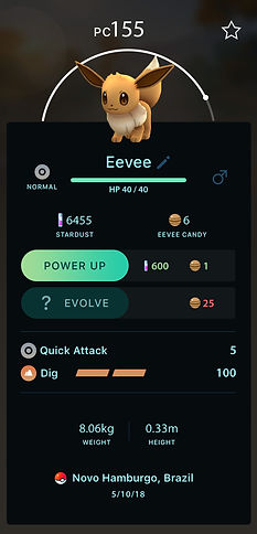
- When player must achieve something in order to be able to unlock functionalities, the requirements must be clear. In this example there is a lack of information about the level required in order to power up the Pokémon (sometimes seems to take more than two level ups on player level).


MORE IMPROVEMENTS
Some of the pointed issues above already points towards solutions, but here are a few more opportunities for design improvement. Some of the following may seem to exceed the onboarding steps, but they all would have some impact already on the first hour of playing.

CONTRAST
MODE
HIGH

Most games doesn't show effort on the accessibility matter once it seems to deliver value for a few. Turns out that accessibility can improves everyones life.
Considering the usual environment of playing Pokémon Go in the street, the "contrast mode" here proposed would be valuable not only for people with low contrast vision impairments and elder, but also for those who are subjected to the bright conditions of the outdoors. It also can save a bit of battery, and also looks good :)
Show me the way
There's already a functionality (bottom down corner) for seeking a Pokémon on a PokéStop nearby, however in order to demand less effort from players to find the place and avoiding the continuous need for looking at the screen ("from here, which is the fastest way to get there?"), a path line and simple GPS guiding voice would be valuable. The less the user must pay attention on the screen rotating/zooming the map while looking for the point, the more it decreases the accident chances and the more it increases user's satisfaction.
Of course a functionality like this demands developing effort, but once the game is based on GPS technology I believe it wouldn't be like starting from scratch.
Current game
With Contrast Mode
and small structural revisions
Clipping line for average mobile screens.
Further informations usually requires sliding.
STRUCTURE REVISED
The most important informations usually must have priority (exceptions are made in games with trade offs for narrative aspects). I've made the changes above based on personal usage, but they would have to be validated (e.g. through AB Testing).
I see two main user tasks here:
Checking combat infos
Powering up/evolving the Pokémon (through investment with game currencies)

Main combat infos
"TYPE" information is influent in combat, as well as health indicators. TYPE make sense here once is related to Pokémon's narrative. Health would make more sense close to combat infos above, but wouldn't fit without major re-design.
Investment infos/functions
Clipping line for average mobile screens.
Narrative/identification infos.
Gender must be here once can influence the NAME identificator edition.
Other combat infos
Other infos
STILL WITH ME? :D
I'm glad you arrived here! So take a breath and follow me to the last section, the re-design of the Gym system!